What Is Slate Blue Color and How Is It Used in Design? The world of design thrives on a diverse palette of colors, each carrying its own story and purpose. Among these hues, slate blue stands out as a sophisticated and versatile choice that bridges the gap between calmness and elegance. But what exactly is slate blue, and how can it elevate your design projects? Let’s explore.
Understanding Slate Blue
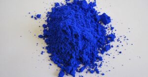
Slate blue is a muted shade of blue with subtle gray undertones, creating a soft and refined appearance. Named after the natural color of slate rock, it evokes a sense of tranquility and timelessness. Its hex code is #6A5ACD, and it often leans toward the cooler side of the color spectrum. This unique blend of blue and gray makes slate blue a favorite among designers looking to create sophisticated and soothing aesthetics.
The Psychology Behind Slate Blue

Colors play a significant role in influencing emotions and perceptions. Slate blue, with its subdued tones, is associated with:
- Calmness: Its gray undertones add a grounding effect, making it less vibrant than pure blue but equally calming.
- Stability: The color exudes a sense of reliability and trust, making it an excellent choice for professional environments.
- Sophistication: Its muted quality conveys elegance and subtlety, ideal for upscale designs.
These psychological traits make slate blue an adaptable choice for both personal and professional projects.
Applications of Slate Blue in Design
1. Interior Design: Slate blue is a popular choice in home decor for walls, furniture, and accents. Its ability to harmonize with both warm and cool tones makes it versatile. Paired with whites, creams, or wood finishes, slate blue can create:
- A serene bedroom ambiance.
- A stylish and inviting living room.
- A refreshing bathroom or kitchen palette.
2. Graphic Design: In digital and print media, slate blue is often used for:
- Backgrounds that need to be calm but engaging.
- Typography when paired with contrasting colors like gold or white.
- Branding for companies seeking a professional yet approachable look.
3. Fashion and Textiles: Slate blue is a favorite in fashion due to its understated elegance. It works well for:
- Business attire like blouses, ties, and suits.
- Evening wear when combined with metallics or jewel tones.
- Casual wear as a versatile neutral.
4. Web Design: On websites, slate blue can enhance user experience by:
- Creating a calming user interface.
- Highlighting important sections without overwhelming the viewer.
- Providing a neutral yet modern backdrop for content.
How to Pair Slate Blue
To make the most of slate blue in your designs, consider the following combinations:
- With Neutrals: Pair slate blue with white, beige, or gray for a clean and minimal look.
- With Warm Tones: Add contrast with warm hues like coral, mustard, or rust for a dynamic and inviting palette.
- With Metallics: Enhance its elegance by incorporating gold, silver, or bronze accents.
- With Other Blues: Create depth by combining slate blue with lighter or darker shades of blue.
Why Choose Slate Blue?
Slate blue’s versatility lies in its ability to adapt to various styles and moods. Whether you’re aiming for a modern, rustic, or classic look, this color can seamlessly integrate into your design. Its calming yet sophisticated nature makes it an excellent choice for creating spaces and visuals that resonate with a wide audience.
Conclusion
Slate blue is more than just a color; it’s a tool for expressi on and emotion in design. Its unique blend of serenity and sophistication offers endless possibilities across various mediums. Whether you’re redesigning a room, crafting a brand, or creating a digital masterpiece, slate blue provides a timeless and adaptable foundation to elevate your work.

